
活生生的生活
我们的任务是创造一种活生生的视觉特征,为品牌的食物产品的品牌,活生生的生命力。
标志由一个符号和一个签名组成,可以在一起或单独生活。微笑是象征“好生活”,使品牌更加友好和容易接近。它是由一个具有签名和排版
同样的人格来创建一个强大的身份,代表性和识别。
选择的颜色和插图来把强调本地方法(魁北克)、工艺品、健康营养,素食主义者和生态有机和无麸质)。通过重要性不同的色调的绿色,质地的牛皮纸,前面的成分与视觉插图蒙特利尔的合作,我们的灵感,我们的灵感,francout格言。
标志是composed of the符号和签名,这能生活在一起或分别。明亮的标志把“活生生的生命”压抑,使布兰德更容易接近。这是一种签字和图表形式,有相同的个性,以创造一种强大的、代表性和可接受的身份。它的颜色和模图的突出特点是地方(魁北克制造)、手工业、健康(生态、营养、血管和游离)和有机方法。而且重要的是注意不同的绿色,它的纹理,在视野中的推理,与一个与一个蒙特利尔,我们的灵感,我们的灵感,我们的灵感一样的幻想。
Bon Vivant (2018)
Notre mandat était de créer une identité visuelle vivante et sympathique pour la marque de produit alimentaire au Chanvre, Bon vivant.
Le logo est composé d'un symbole et d'une signature, pouvant vivre ensemble ou séparément. Le symbole souriant représente le "bon vivant" et rend la marque plus sympathique et facile d'approche. Il est soutenu par une signature et typographie ayant
la même personnalité pour créer une identité forte, représentative et reconnaissable.
La palette de couleur et le choix d'illustration viennent mettre l'emphase sur l'approche local (fait au Québec), artisanal, santé (écologique, nutritif, vegan et sans gluten) et organique. Et ce par l'importance des différentes teintes de vert, la texture du kraft, la mise de l'avant des ingrédients dans les visuels et la collaboration avec un illustrateur de Montréal, notre muse, notre inspiration, Maxime Francout.
The logo is composed of a symbol and a signature, which can live together or separately. The smiling symbol represents the “bon vivant” and makes the brand more friendly and easy to approach. It is supported by a signature and typography having the same personality to create a strong, representative and recognizable identity. The color palette and the choice of illustration highlight the local (made in Quebec), artisanal, health (ecological, nutritious, vegan and gluten-free) and organic approaches. And it is important to note the different shades of green, the texture of the kraft, the putting forward of the ingredients in the visuals and the collaboration with an illustrator of Montreal, our muse, our inspiration, Maxime Francout.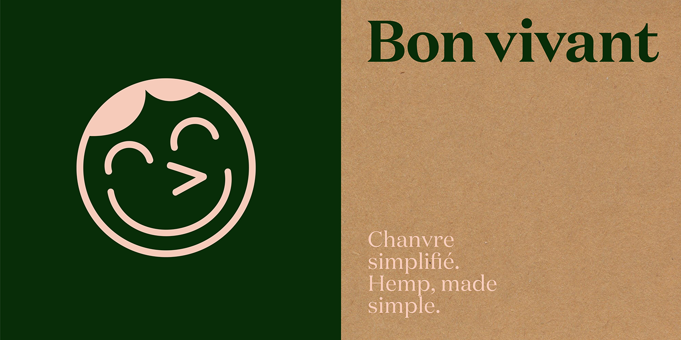


深圳市顶点企业形象策划有限公司是一家专注企业品牌形象策划的设计公司,主要是品牌设计,品牌策划,企业品牌形象设计,企业产品形象画册设计,企业形象VI设计,标志(logo)设计,环境导示系统,企业形象画册,品牌形象产品画册的策划和设计执行。
